This week’s Scrivener Saturday: Unique Ways to Use Full-Screen Mode.
By default, full-screen mode in Scrivener is rather clutter free with basic settings at the bottom:
- text scale–how large you want the text to be
- paper position–left, right, or center of the screen
- paper width–how wide the sheet of paper is displayed
- keywords–toggles the keyword pop-up box on and off (click here for more on using keywords)
- inspector–pulls up the side inspector so you can display document notes, keywords, meta-data, or whatever else you need while you work. I find this the most helpful of the options.
- Go-To–allows you to jump to different documents in your project file without leaving full-screen mode
- word count
- character count
- paper fade–allows you to see through to the background or not
- exit full-screen mode button
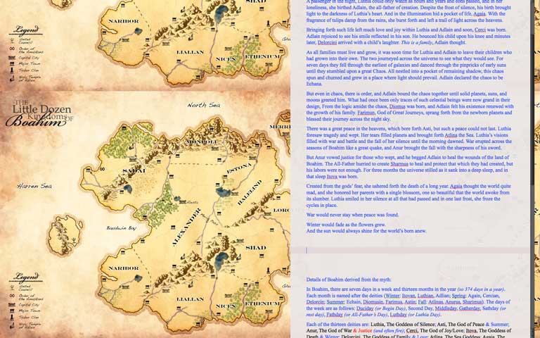
I want to take a moment to talk about paper fade, as this is one item I feel people overlook. When I was writing Amaskan’s Blood, I set my full-screen composition mode background to the map of Boahim so that when I’m writing, I don’t have to exit full-screen mode to check where a city or road is in my world. Then I fade the paper to whatever it takes to see my map. See image below:

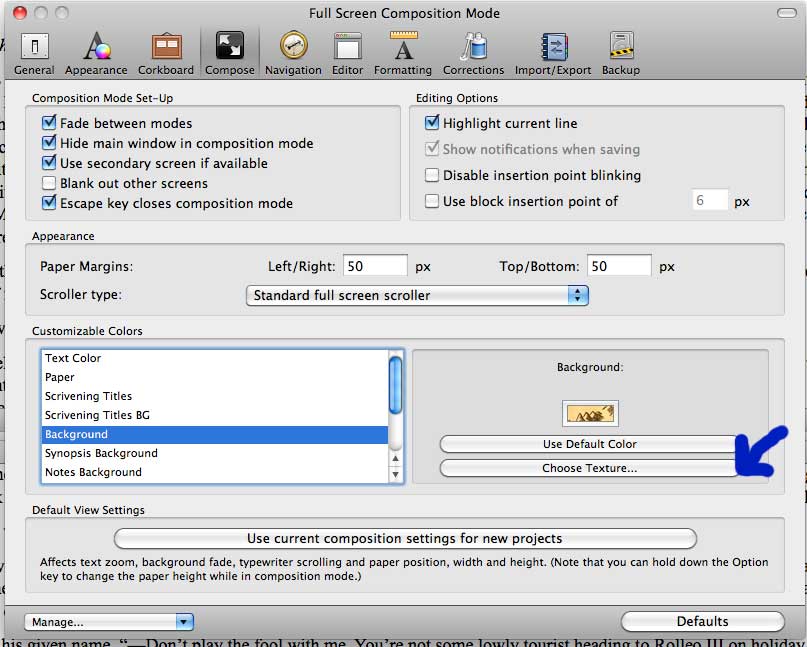
To change your background, go to Scrivener –> Preferences and click on Compose. Under Customizable Colors, click on Background, then Choose Texture. Then find your image.

Another way I’ve used Full-Screen Mode is by pulling up the Inspector in a pop-up box with a running list of characters (project notes) or the diagram/map of a ship (picture), research and references, or whatever else I need up beside me while I write.
The point of full-screen mode is not to be as cluttered as some people find the normal writing mode in Scrivener, so be careful what you put as your background or what pop-ups you place nearby.
What I Love about This Feature: When I need distraction free writing or I’m feeling rather ADD, this is a great mode to use while still having access to important chunks of information.
Downside to This Feature: I really wish the background images didn’t tile. Or that there was a setting to either tile them or resize them.
Check out the entire series of Scrivener Saturday posts here.


